Howdy Friends,
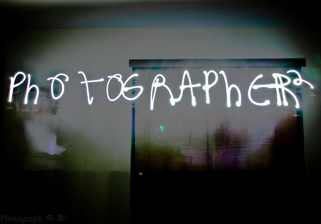
I’m considering making this the header for the blog. What do you guys think?
Also, it’s really sad that my handwriting isn’t any worse than my regular handwriting in this photo. At first, I thought it was cool how similar my actual handwriting and blindly waving a light around in the the dark were. Then I felt bad for every teacher I’ve ever had.
Love,
Matt


Dude yes. I thought this was a photoshop at first. I am even more impressed now.
Okay, the light-writing thing is pretty bad-ass, once you consider that it's been done without Photoshop ease. However, as a header, you need to modify it a bit. Maybe crop the bottom some. It looks a bit ungainly and chunky up there, like it's making your page top heavy. So, I'm voting a "no" — unless you edit it.
Pretty cool though. You still get props.
Absolutely.
Thanks for the input guys.
Hilary, my wife was saying the same thing.
I cropped it up a bit. I hope that works a little bit better.
Yup, that looks great now. I changed my vote to "yes."